The Little Typewriter
BRANDING, PRINT COLLATERAL, SOCIAL MEDIAIndustry: Children’s Arts & Crafts
The Little Typewriter is a playful, warm and thoughtful children’s stationery and creative-play brand. Children’s brands often fall into two camps: loud, primary-coloured and mass-produced, or so minimal that they lose their sense of fun. The challenge for this brief was to create an identity that looked beautiful on a shelf and in a home, felt playful without feeling childish, and communicated creativity and imagination at a glance.
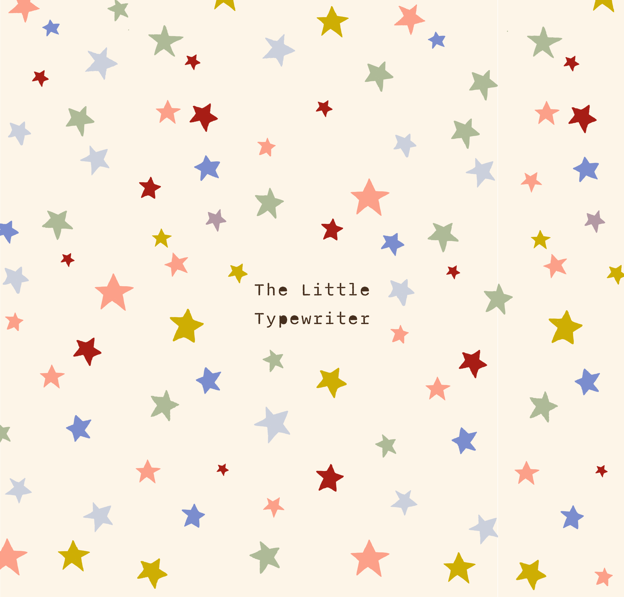
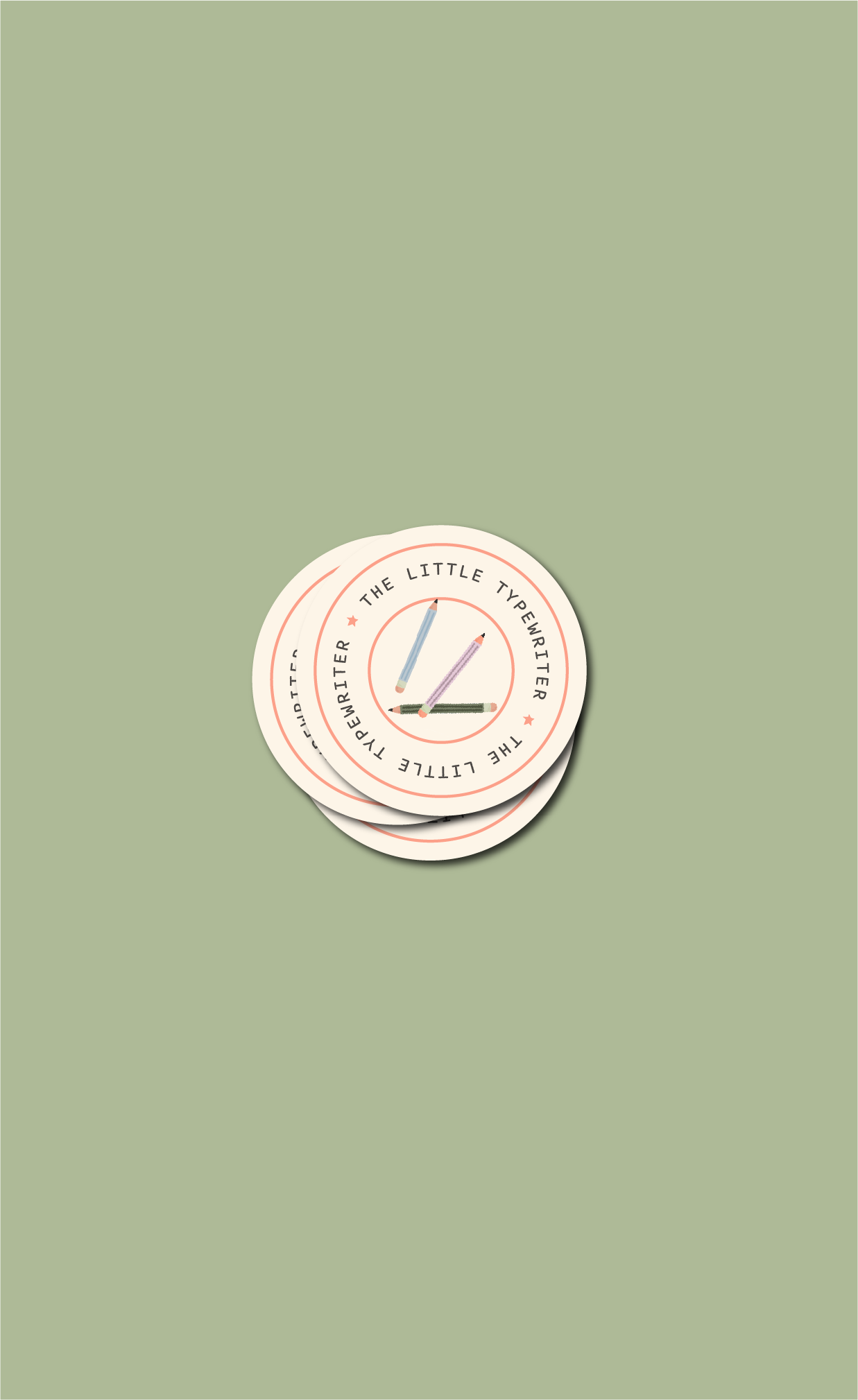
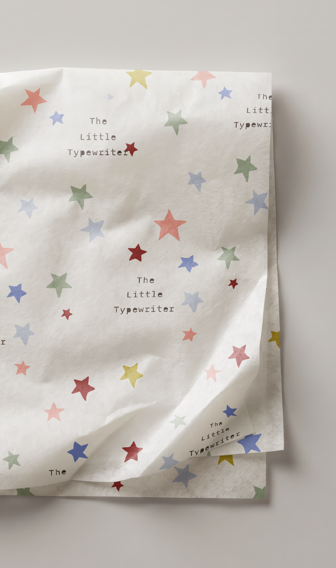
Included in the scope of this project were a logo suite, hand drawn patterns and illustrations, colour palette, typography, social media templates, packaging and stickers. Each element captures The Little Typewriter’s personality of playful and nostalgic, creating a cohesive and memorable brand experience that resonates with both parents and the brand’s values.
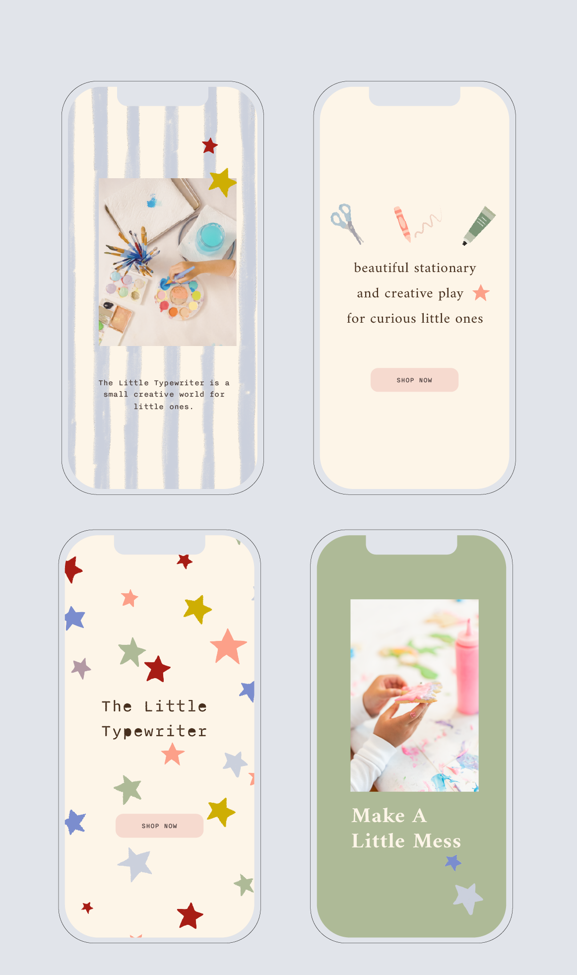
APPLICATION & USAGEFlora’s brand is applied across key touch points to create a seamless and engaging experience that reflects the brand’s personality and values. The eco-friendly packaging reinforces the commitment to sustainability, using recycled materials and natural textures to make every product feel thoughtful and environmentally responsible.
Business cards serve as a tangible introduction to the brand, using playful typography and vibrant colours to immediately convey Flora’s creative and modern ethos. Social media templates ensure a cohesive online presence
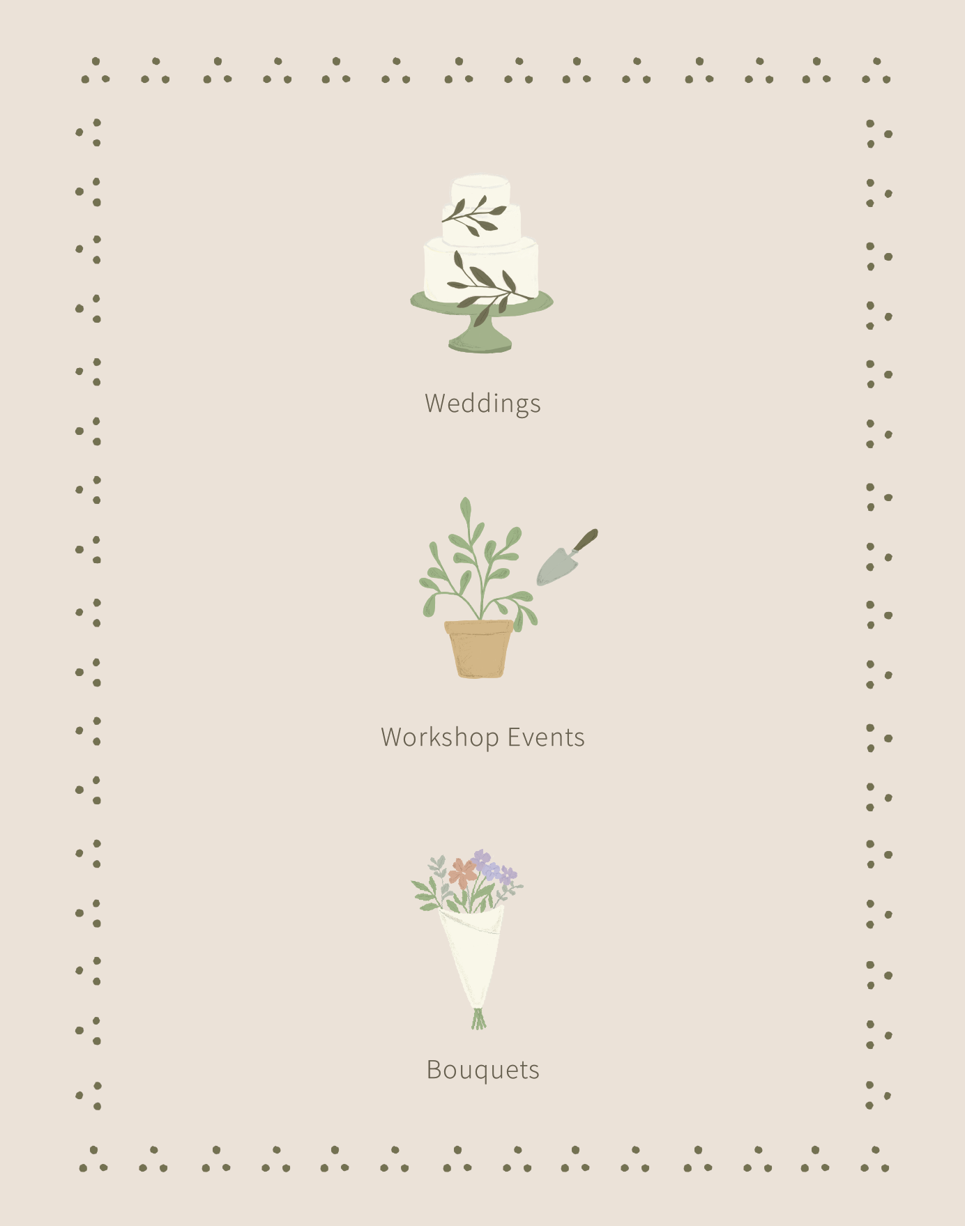
DESIGN NOTESA vibrant colour palette, featuring soft greens, yellows, and pops of pink, evokes the freshness of flowers, while earthy tones reflect the brand’s eco-conscious approach. Modern sans-serif typography is paired with hand-drawn accents to convey Flora’s artistic, personal touch.
Organic elements like floral illustrations and recycled materials are used across all touch points, from business cards to eco-friendly packaging, ensuring a cohesive and memorable brand experience that is both modern and environmentally responsible.